图表作文,7分范文分享,雅思图表作文难吗?雅思图表作文一般考那些?
深圳环球雅思
TRC
史凯齐
You should spend about 20 minutes on this task.
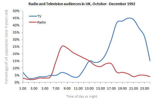
The graph below shows radio and television audiences throughout the day in 1992.
Write a report for a university lecturer describing the information shown below.
Write at least 150 words.

范文:
The blue graph shows the television audiences throughout the day. It shows that the percentage of audiences is three percent in early morning but it gradually rises unto ten percent at 8:00 am and maintains the same for the next two hours. There is a slight fall in percentage in next two hours however after that it raises sharp unto twenty percent within the next two hours. After this the graph rises very fast and attains its peak at 10 pm which is about forty five percent. The graph gradually falls down and at 2:00 am it is at five percent. The red graph shows the percentage for radio audiences. Unlike the television one the peak percentage of the radio audiences is at 8:00 am which is about 30 percent. Then it gradually falls and it corresponds with the television one at two pm. After that it gradually falls but with a small increase in percentage at 4:30 to 6:00 pm. The percentage of audience then gradually goes down and at four AM it is the lowest which is near 2 percent. These graphs prove the progressive popularity of television.
(191 words)
考官评语:
Band 7
“The answer deals well with both the individual media trends and the overall comparison of these trends. The opening could be more fully developed with the inclusion of information relating to the groups studied and the period of time during which the study took place. There is a good variety of cohesive devices and the message can be followed quite easily although the expression is sometimes a little clumsy. Structures are complex and vocabulary is varied but there are errors in word forms, tense and voice though these do not impede communication.”

